World Health Index Analysis
Kaggle source link | Download R Script | Download CSV file
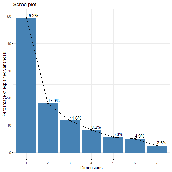
Note:
- Djibouti, Maldives, Oman, Puerto Rico, and Suriname are not in this analysis due to grossly missing data.
- The variables 'Country' and 'Region/Continent' are not taken into account when calculating for World Happiness Index in this analysis.
- Missing data is treated as Missing At Random (MAR) even though it's probably Missing Not at Random (MNaR).
- The figure above explains 67.1% of total variance.
Motivation behind the project
In my intro to Data Science class at San Jose State University, there was a group project that constitutes 15% of the overall grade. Despite getting an A, I was somewhat dissatisfied because the content does not faithfully correspond to the methodology we presented. For example, I espoused a stochastic imputation, but the 'stochastic' part ended on a majority vote for number of clusters after bayesian information criterion (BIC) was ran on all the imputations, when it should have carried on to the principle component analysis and gaussian mixed models. Now that I have time, I could finally extend the project to my professional satisfaction as a showcase for my entry-level job search.
There was no special reason behind my group's choosing World Happiness Index over any other datasets, it simply looked interesting what we would find in the analysis.
The Data
The data was taken from user 'Agra Fintech' on Kaggle, an online learning platform similar to LeetCode, who claims to get it from the World Happiness Index. The World Happiness Index (WHI) is published by the Wellbeing Research Centre at the University of Oxford, in partnership with Gallup, the UN Sustainable Development Solutions Network and an independent editorial board.
The Gallup World Poll is the product of Gallup Incorporated, a private company-owned analytics firm. The Gallup world poll is funded by Gallup Inc., licensing and subsciption fees, and partner funded modules like Wellcome Global Monitor, Lloyd's Register Foundation, and the World Bank.
The data has 16 columns:
- Year
- Country
- Continent/Region
- Headline Consumer Price Inflation
- Energy Consumer Price Inflation
- Food Consumer Price Inflation
- Official Core Consumer Price Inflation
- Producer Price Inflation
- GDP Deflator Index Growth Rate
- Score (the dependent variable)
- GDP per Capita
- Social support
- Healthy life expectancy at birth
- Freedom to make life choices
- Generosity
- Perceptions of corruption
Methodology of Data Collection: According to Gallup, the way surveys are carried out depends on the country.
- If a country has strong phone coverage (at least 80%), Gallup goes with the random-digit-dial (RDD) method. The numbers themselves come from regional sample providers such as Sample Answers and Sample Solutions.
- In countries where phone coverage isn’t as widespread, Gallup instead sends interviewers into randomly selected households, following an “area frame” design.
- The intended coverage is nationwide—including rural areas. The only exceptions are cases where it’s unsafe for interviewers, or in very sparsely populated islands (Gallup doesn’t say exactly which countries this applies to).
Sampling Procedures
Step 1 — Choosing the areas (PSUs): For face-to-face surveys, Gallup first defines “primary sampling units” (PSUs), which are basically clusters of households. These are stratified by population size and geography. When population counts are available, they use probabilities proportional to size; otherwise, they fall back on simple random sampling. For phone surveys, it’s either RDD or a representative phone list. In places where cellphones are common, Gallup mixes landline and mobile samples. Interviewers try each number at least three times.
Step 2 — Choosing the households: Within each selected PSU, interviewers follow a random route to pick households. If no one answers or they get a refusal, they’ll try up to three times at different times of day, and even different days. If there’s still no luck, they substitute with another household.
Step 3 — Choosing the respondents: Once in a household, respondents are selected randomly using either the “latest birthday” method or a Kish grid. In some Middle Eastern and Asian countries, interviews need to be gender-matched, so probability sampling is combined with quotas at this final stage. Gallup also runs quality checks to make sure interviewers really are following the random selection rules.
Missing data type is probably Missing Not at Random (MNaR) but for the sake of analysis simplicity, I'll treat it as Missing at Random (MaR).
What is PCA?
Principle Component Analysis (PCA) is a dimensional reduction technique that tries to explain an original dataset using a smaller dimension (the smaller, the better). With the tradeoff being how representative this smaller dimension dataset captures the original - the % explained variance. In my case I want to collapse the 7 columns to 2 axes; so that I can do a 2-dimensional time-series visualization on it.
'dimensional reduction'? 'explained variance'?

Imagine this portable charger is a dataset of 3 variables: length, width, and height. I want to snap a photo of it (reduce it to 2-Dimensions), and I want as much of the portable charger's length, width and height as possible inside the photo. Intuitively we can deduce that the longest line could be from the bottom left corner to its lengthwise-opposite right top corner, making up the first axis. The second axis is a line perpendicular to the first that also goes from bottom-top l/r corners, but this time widthwise. However, does this photo explain the portable charger's L/W/H well? We can argue that since the photo is orthogonal, it is hard to see the actual length because the axes 'squishes' the length/width/height information into a composite vector made up of varying weights of length/width/height. (If we normalize this vector we get an eigenvector)
Ok, so what does PC1 and PC2 actually represent?
We don't actually know what it represents. Maybe PC1 can reasonably be called 'Socioeconomic factors', because GDP per Capita, Social support, freedom to make life choices, and Healthy life expectancy at birth contributes quite a lot to PC1. And maybe PC2 can be called 'Values/Societal attitudes', because Generosity, and perceptions of corruption contribute mostly to PC2. We can only guess to its label looking at the various arrows contributing to the axes, and their relationships as described within the rules of 2-D graphs.
As for what PCs are, they are eigenvectors of the dataset. PC1 represents the eigenvector which explains the most variability and PC2 represents the orthogonal eigenvector that explains the second-most variability. The respective eigenvalues are the variances.
In this dataset's case (after stochastic linear regression, and stochastic predictive mean matching imputation) we have this screechart denoting the variability of each PC:
What is 'imputation'?
Imputation is the process of filling in missing values in the dataset with plausible estimates, while preserving the original distribution of the data, avoid systemic bias, and maintain statistical validity.
- There are several countries with missing values on one or two years. I took the values of their other years, take a best fit LR line of those data, and put in the intersection of the missing years and that best fit line's value + noise into the data frame.
- There are several countries with missing values on most or all years. I took the closest observed value of the mean of similar countries (from Regions/Continents column) and put that in to the countries' respective year in the data frame.
Types of missing data
This is very important in how we choose which imputation methods to apply to missing values.
- The least constraining one. The probability of missingness is independent of both observed and unobserved data, so you can pretty much choose whichever imputation you deem best. How it happens: a lab technician accidentally loses some test tubes. Oops!
- Missingness depends on observed data, the most common working assumption. Most imputation methods assume MAR. How it happens: survey responders who are ___ will be less likely to answer ___.
- The most constraining one. Missingness depends on the unobserved value itself, even after accounting for other variables. We would need some special imputation methods like selection models or sensitivity analysis. For example, rich people are less likely to report income.
Interpretation of plot
Score is the world happiness index and all the other loading vectors (arrows) represent their relationship to the score. A 0° angle means correlation, 90° means independence, 180° means inverse correlation. So, we can say:
- Social support, GDP per capita and healthy life expectancy at birth are almost at the same angle. We can say that any 1 unit change of either three contribute mostly the same unit of change to score.
- Generosity is almost perpendicular to Score. We can say that any 1 unit of change to generosity means very little change to score.
- 'Freedom to make life choices', and 'Perceptions of corruption' are 30 degrees and 45 degrees to Score, we can say that any 1 unit change to 'Freedom to make life choices' changes scrore by 1/3 of a unit while a change to 'Perceptions of corruption' changes score by 1/2 a unit.
But wait - not only can we measure score against the other loading vectors, we can also measure loading vectors against other loading vectors! So,
- Generosity and Perceptions of corruption is mostly but not completely independent from GDP per capita, Social support, and Healthy life expectancy at birth (GDPpc, SSupport, HLEatBirth) which is interesting; you'd think with more Generosity in a culture, Social Support will increase, but this PCA disagrees. This PCA shows that cultural norms play very little impact to government policy.
- Amusingly, the more Freedom to make life choices you have, the more Perceptions of corruption you also have.
- Interestingly, the PC2 component of GDP per capita, Social support, and Healthy life expectancy at birth is on the opposite direction of Generosity
Furthermore, as a time-series visualization, we might be able to see the effects of global trends.
- The most obvious has to be the period between 2019 and 2021 - where the Sars-Coronavirus 2 pandemic lowered the global average score briefly.
I also wanted to do some sort of clustering analysis, and the simplest one I could think of that could handle numeric data was K-means. But I wanted something more robust - Gaussian Mixture Models (GMM) does soft clustering on the assumption that each cluster have a Gaussian distribution (round shape). GMM also consider covariance matrices, so we can have different ovals and size of clusters:
- Starting with the group on the far left: these countries generally show lower GDP per capita, social support, and healthy life expectancy, with less freedom to make life choices and lower scores on corruption perceptions. You might think of them as places still working through a lot of economic and institutional hurdles. But of course, it’s not one-size-fits-all — for example, India looks quite different here compared to countries like Sierra Leone or South Sudan. And keep in mind, the PCA only captures about two-thirds of the variation.
- On the opposite side, in the right and lower-right corner, we have countries that rank high on GDP, social support, and life expectancy. They also tend to do really well on freedom to make life choices and corruption perceptions, with generosity somewhere between medium and high. This feels like the “very stable and safe” cluster, though even here, each country has its own story.
- Down in the middle-bottom area, there’s a cluster with mid-range happiness scores but the highest generosity overall. At the same time, they report higher corruption and pretty strong freedom to make life choices, with GDP, social support, and life expectancy sitting in the middle. These could be thought of as “developing contexts,” where people give a lot, but broader systems are still uneven.
- Then there’s a group closer to the center but higher on the PC2 axis. These countries tend to show lower generosity, less freedom, and less positive corruption scores, but they do somewhat better economically and in terms of health compared to the first group. You could think of them as “catching up materially, but with social and civic measures lagging a bit.”
- Finally, in the top-right quadrant, we see another set of stronger economies with good health and freedom scores, quite similar to the stable group on the right. The main difference is that this cluster shows lower generosity. So maybe think of it as “high-capacity countries, but with slightly less focus on giving.”